空间界限 取舍之间平衡居住空间的边与度
私宅设计不应被所谓的功能区分而限制空间的想象力,空间的尺度、格局与功能实现度应该和生活习惯相协调,居住行为与生活空间和谐对话,才能真正实现人在空间里的惬意和愉悦。
Private House design should not be limited by the so-called function of the imagination of space, space scale, pattern and function of the degree of realization should be in harmony with living habits, personal behavior and living space harmonious dialogue, in order to really achieve the space in the pleasant and pleasant.
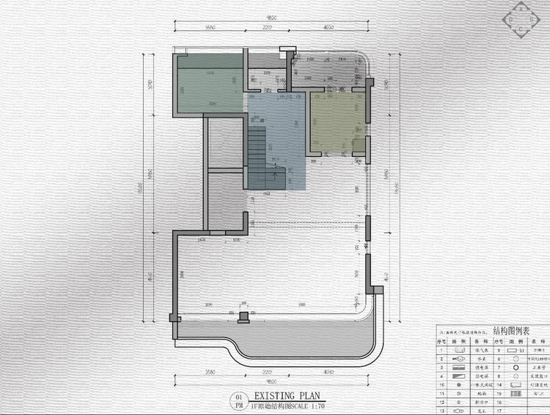
△一楼原始平面图
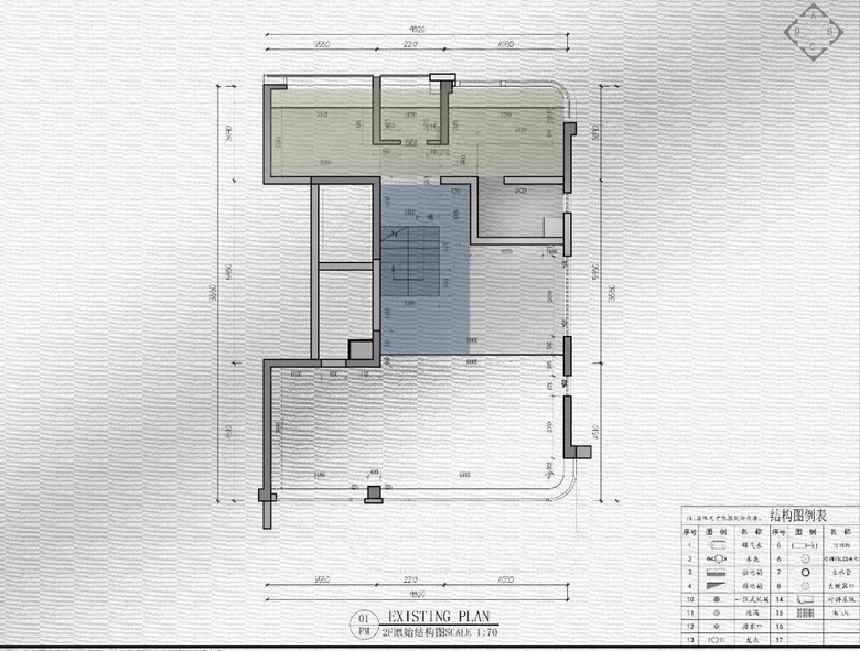
△二楼原始平面图
原户型一楼入户进门没有收纳区域,楼梯侧面高度差不美观,厨房封闭而小,空间缺少连贯开阔性。卧室区域面积拥挤,二楼原来楼梯双跑占位较宽,影响行走通道与开放书房区域,原有两间卧室都因为飘窗占位空间狭小。
The original huxing first floor entry door no reception area, staircase side height is not beautiful, the kitchen closed and small, the lack of a coherent open space. The bedroom area is crowded, the stairs on the second floor double run occupied a wider space, affecting the walk-through and open study area, the original two bedrooms because bay window occupied space is small.
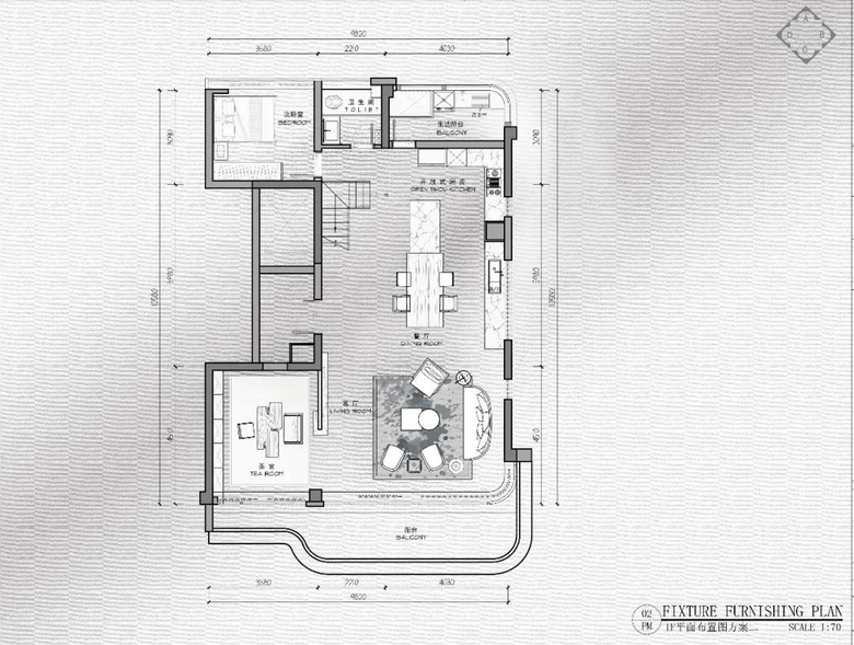
△一楼平面布置图
在整体的功能分区上,巧妙调整楼梯上楼位置,归整靠边,让行走动线更流畅。同时也满足了入户侧面就有了收纳功能,更让开阔的餐厨区拥有了强大的隐藏收纳一体化空间,保障实际生活里有了分类收纳后、能真正保持利落大气。打开曾经一小间厨房与原来的小餐厅合并,横纵拉开公共交互空间的尺度,成为阔景大厅。挪动进出生活阳台动线,让厨房功能区更加完整,同时精细化所有设备尺寸,隐蔽、美观好设备的同时,满足设备房上部分收纳,尽可能扩大了生活区收纳与晾晒尺度。
In the overall functional area, skillfully adjust the location of the stairs upstairs, back to the side, so that more smooth walking line. At the same time, also meet the door side has a storage function, more so that the open kitchen area has a strong hidden storage integration space, to ensure that the actual life has a classification of storage, can really keep neat atmosphere. Open once a small kitchen and the original small restaurant merger, horizontal and vertical pull open the scale of public interactive space, become a spacious hall. Moving in and out of the living balcony line, so that the kitchen function area more complete, while fine all equipment size, concealed, beautiful equipment, meet the equipment room part of the storage, as far as possible to expand the living area storage and drying scale.
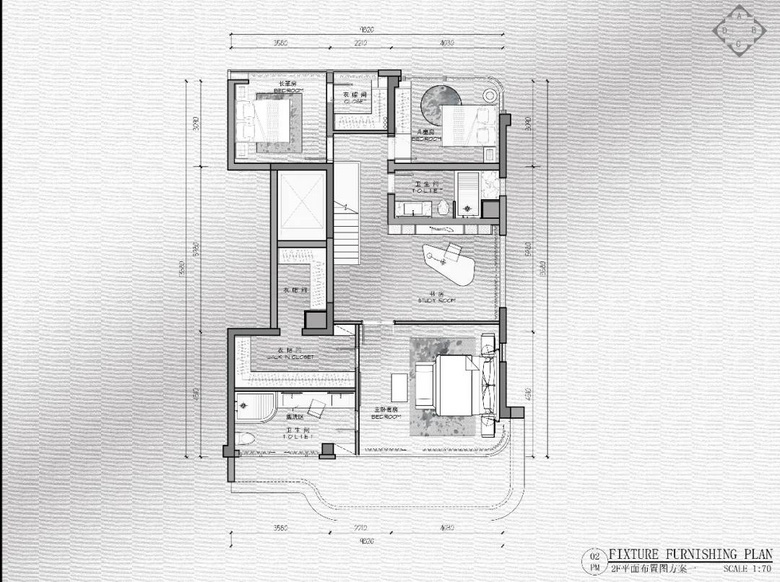
△二楼平面布置图
卧室区域通过现场勘测,发现飘窗台可去掉,遂打掉增加了空间利用,扩大了卧室尺度,更与其它空间巧妙借用尽可能给部分房间增设了衣帽间功能。
现浇楼板根据采光通风面合理布局了主卧、阳光卫生间,借用一楼公共通道顶部增设了男主人衣帽间,保障了品质住宅男女主人衣帽间分设而置的人性化设计。
The bedroom area was surveyed on site andfound that the bay window sill could be removed, which increased the use ofspace, enlarged the bedroom size, and cleverly borrowed from other spaces toadd cloakroom functions to some rooms as much as possible.
The cast-in-situ floor slab rationallyarranges the master bedroom and sunny bathroom according to the lighting andventilation surface. The male master cloakroom is added at the top of thepublic passage on the first floor, which guarantees the humanized design ofseparate cloakrooms for the male and female masters of the quality house.
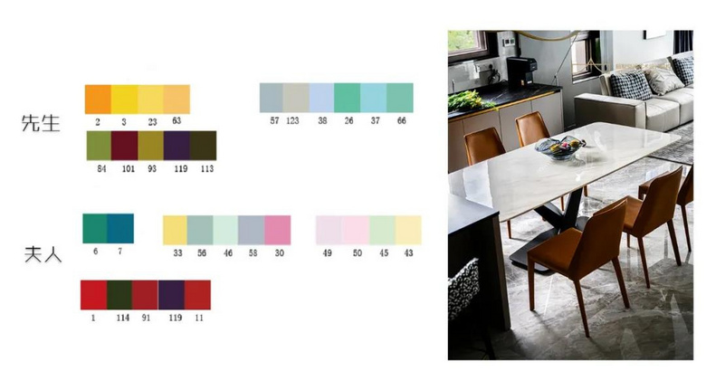
室内设计当如是,运用专业的分析软件,找到了男女主人分别喜好的空间调性。男主人理性逻辑、钢铁直男又不乏轻松感的审美,女主人是柔和甜美、满满少女心的需求。审美没有高低之分,找到主人内心最贴切渴望回归的家,用我们的专业去实现他们的梦想,就是私宅最应该遵循的原则。
所以根据两人的分析,采用了大空间尊重男主人的个性,开阔直线块面解构,大量引进空间自然光,保障通透;软装上大空间灰调层次过渡,局部宝蓝色、爱马仕橙色打破沉闷。主卧室作为私密空间以反差手法融合两人喜好,块面线条构成尊重男主人,色系搭配尊重女主人,营造出浪漫里的简雅质感。